How to Use Color Effectively in Your Photography: 8 Tips to Look Like a Pro When You're Just Starting Out
Understanding color theory is crucial for photographers aiming to enhance their visual storytelling. At its core, color theory involves the color wheel, where primary colors (red, blue, yellow) mix to form secondary and tertiary colors. Key relationships include complementary colors, offering contrast, and analogous colors, providing harmony. Colors also evoke emotions—warm tones like reds and yellows energize, while cool tones like blues and greens calm. Mastering color harmony and contrast can make images more compelling. By incorporating these principles, photographers can create visually striking and emotionally resonant photographs, using color to craft mood and atmosphere.
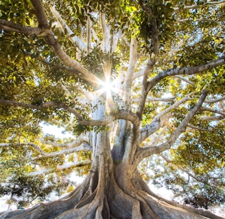
COLOR THEORYHOW TOTIPS AND TRICKS


Understanding the Basics of Color Theory
Color theory is an essential foundation for any photographer looking to enhance their visual storytelling. At its core, color theory involves understanding the color wheel, which is a circular diagram of colors arranged by their chromatic relationship. The primary colors—red, blue, and yellow—serve as the basis for creating all other colors on the wheel. Mixing these primaries results in secondary colors: green, orange, and purple. Further blending yields tertiary colors, such as red-orange or blue-green.
Beyond the color wheel, it’s crucial to grasp the relationships between different colors. Complementary colors, which sit opposite each other on the wheel (like blue and orange), create a high level of contrast and can make elements in your photograph pop. Analogous colors, found next to each other on the wheel (such as blue, blue-green, and green), offer a more harmonious and cohesive look. Triadic color schemes involve three colors evenly spaced around the wheel (like red, yellow, and blue) and provide a vibrant yet balanced composition.
Understanding how colors evoke emotions can significantly impact your photography. Warm colors, such as reds and yellows, often evoke feelings of warmth, energy, and passion. Cool colors, like blues and greens, tend to convey calmness, serenity, and professionalism. By deliberately choosing colors based on the emotions you wish to evoke, you can create more intentional and compelling photographs.
Concepts of color harmony and contrast are also pivotal. Color harmony refers to the aesthetically pleasing arrangement of colors, achieved through various schemes like complementary, analogous, or triadic. Using harmonious colors can make your images more visually appealing and soothing, while strategic use of contrast can draw attention to specific elements and create dynamic compositions.
By mastering these basics of color theory, you will be better equipped to make informed decisions about color in your photography. This foundational knowledge will enable you to create images that are not only visually striking but also emotionally resonant.
Using Color to Create Mood and Atmosphere
One of the most powerful tools in a photographer's arsenal is the ability to use color to create mood and atmosphere. Understanding how different colors affect emotions can significantly enhance the storytelling aspect of your photographs. Warm colors like reds, oranges, and yellows are often associated with feelings of warmth, energy, and excitement. These colors can be used effectively in scenes that aim to convey passion, vibrancy, or a sense of urgency. For example, a photograph of a bustling market at sunset can be enriched by the warm hues bouncing off the surroundings, adding to the lively atmosphere.
Conversely, cool colors such as blues, greens, and purples evoke calmness, serenity, and sometimes melancholy. These colors are ideal for landscapes, seascapes, or any scene where tranquility is the desired effect. A photograph of a serene lake at dawn bathed in soft blue and green tones can instantly transport the viewer to a place of peace and reflection.
Color saturation also plays a crucial role in setting the mood. Highly saturated colors can make a photograph feel more intense and vibrant, while desaturated colors can give it a more subdued, nostalgic, or even somber tone. For instance, a cityscape drenched in the saturated neon lights of night can exude energy and modernity, whereas the same cityscape portrayed in muted tones can evoke a sense of timelessness and quiet reflection.
Monochromatic color schemes, where a single color dominates the image, can be particularly effective in creating a specific emotional impact. A photograph dominated by shades of blue can convey a sense of calm and introspection, whereas one dominated by reds can evoke passion and intensity. These schemes can simplify the composition and focus the viewer's attention on the emotional undercurrents of the scene.
Practical examples and case studies further illustrate the effectiveness of using color to set mood. For instance, the work of photographer Steve McCurry often features strong color choices that enhance the emotional weight of his subjects. Whether it’s the vibrant robes of a monk set against a muted background, or the rich, warm tones of an Indian marketplace, McCurry's use of color is a masterclass in creating atmosphere and narrative through photography.
Practical Tips for Incorporating Color in Your Photography
Incorporating color effectively in your photography can elevate your work, making your images vibrant and engaging. One of the first steps is to scout for colorful locations. Urban environments often offer a plethora of colorful backdrops, from graffiti walls to bustling markets. Nature, too, provides rich color palettes with blooming flowers, autumn leaves, or clear blue skies. Always keep an eye out for these opportunities to infuse your photos with natural hues.
Using props and clothing can also introduce pops of color to your shots. Simple items like a bright umbrella or a colorful scarf can contrast beautifully with a neutral background. When selecting props, think about complementary colors that can enhance the overall composition. For instance, a red prop against a green background can make both colors stand out more vividly.
Experimenting with color in post-processing is another powerful tool. Software like Adobe Lightroom or Photoshop allows you to adjust saturation, hue, and brightness to achieve the desired effect. However, moderation is key; over-editing can result in unnatural-looking images. Aim for subtle adjustments that enhance the colors without overshadowing the subject.
Balancing colors in a composition is crucial to avoid color clashes. The color wheel can be an invaluable resource for understanding which colors work well together. Complementary colors, those opposite each other on the wheel, often create a pleasing contrast. Analogous colors, those next to each other, can provide harmonious and soothing visuals.
Using color to guide the viewer's eye through the image can add depth to your photography. Leading lines in a strong color can draw attention to the focal point. Similarly, placing a brightly colored subject against a muted background can make it stand out, directing the viewer's gaze naturally.
Natural light plays a significant role in bringing out the true colors in your photos. Golden hour, the period shortly after sunrise or before sunset, is particularly flattering for capturing warm tones. Adjusting your camera settings, such as white balance, can also help in accurately capturing colors. For instance, using daylight white balance in natural light settings ensures that the colors appear as true to life as possible.
By implementing these practical tips, you can effectively incorporate color into your photography, enhancing the visual impact and professionalism of your work.
Good luck!